
 |
 |
 |
 |
 |
 |
 |
 |
 |
2.2 Experiment Window
When an experiment is started at least one another window will pop up.
It is up to the writer of the EDL script to choose if the
window will be used for displaying curves or color-coded surfaces or
both at once, see the functions init_1d() and
init_2d() in one of the later chapters. The first type of
display is well suited for showing the results of typical cw-measured
EPR data or traces fetched from digitizers, while the second type is
for useful for visualizing 2-dimensional experiments, i.e. all
experiments where more than one parameter is changed during the
experiment. Sometimes it also might be useful to display curves as
well as surfaces, in which case a window for both display modes can be
created.
| • 1D-Display | Displaying data for one-dimensional experiments | |
| • 2D-Display | Displaying data for two-dimensional experiments | |
| • Cross Sections | Displaying cross sections through two-dimensional data |
|
|
|
|
|
|
|
|
|
2.2.1 1D-Display
Here's a typical example of the kind of display you may get while doing an experiment:
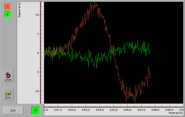
The most prominent feature is the area for displaying the measured data. In this case two different curves are displayed simultaneously (but you can have up to four). They show data from the x- and y-channel of a lock-in amplifier while recording a cw-EPR spectrum - obviously the lock-in's phase setting isn't optimal yet.
Below and to the left of this main display area are two areas showing the x- and y-scales. The fact that the lines in both the axis areas are drawn in red indicates that the scales are valid (at least) for the first (red) curve.
The topmost buttons on the left side (which both are switched on here) let you decide which of the curves will be included in rescaling operations - this way you can rescale curves individually to account for e.g. different sensitivity settings or to simply move them apart.
The two buttons below, labeled Undo and Print allow you to
undo the last rescaling operation or to send a snapshot of the current
results to a printer (or, alternatively, write it to a file).
Please note: When printing using a different command than the built-in
command ("lpr -h") please be aware that the print command will
receive its input (in PostScript) on its standard input channel. Some
programs require that you specify a single dash (-) in place of a
file name in this case. For example, if you want to view the snapshot
with ghostscript instead of directly sending it to a printer you have
to enter "ghostview -" as the print command.
The Stop button lets you abort the currently running experiment -
when the experiment is finished its label changes to
Close. Finally, the button labeled FS is the "Full Scale"
button. While this button is active the display is resized automatically
so that all data fit into the display area.
But there's also a second mode for displaying data in 1D mode. Beside the mode where the scaling is automatically adjusted to fit all data, there's a mode where the data in x-direction get shifted through the display window: new data are drawn at the right side, and if there are more data than would fit into the window the oldest data get shifted out of the window to the left - similar to a news-ticker.
| • Examining data | Finding out more about your data | |
| • Rescaling and moving | Zooming in and out |
|
|
|
|
|
|
|
|
|
2.2.1.1 Examining data
If you want to find out the exact values of your newly measured data
during the experiment you have to move the mouse into the display area
onto the point you're interested in. Now press both the left and the
middle mouse button simultaneously (or first the left one, then the
middle one while keeping the left button pressed down). The cursor
changes to a cross-hair
cursor,  ,
and in the upper left hand corner pairs of values with the exact
coordinates (in the units of the axis scales) of the current mouse
position are shown. Because different curves can have a different
scaling (see below) the coordinates in the current scaling system of
each of the curves are shown (in the color of the curve they belong to)
if more than one curve is displayed.
,
and in the upper left hand corner pairs of values with the exact
coordinates (in the units of the axis scales) of the current mouse
position are shown. Because different curves can have a different
scaling (see below) the coordinates in the current scaling system of
each of the curves are shown (in the color of the curve they belong to)
if more than one curve is displayed.
Beside finding out the exact values of your measured data you also may
determine differences between data points, e.g. to measure line widths
or signal intensities. If you press both the left and the right mouse
button simultaneously (or first the left mouse button an then the right
one while keeping the left one pressed down) the cursor changes to an
encircled cross-hair
cursor,  ,
and a circle is drawn at the position where you pressed the mouse
buttons. When you move the mouse (while keeping both middle and right
mouse buttons pressed down) a vertical and a horizontal dashed line
connecting the starting point to the current mouse position is drawn and
in the left upper corner of the display area pairs of x- and
y-differences (in units of the axis scales) between the two points are
shown (and updated whenever you move the mouse). Again, for each curve a
pair of values is displayed in the color of the curve they belong to.
,
and a circle is drawn at the position where you pressed the mouse
buttons. When you move the mouse (while keeping both middle and right
mouse buttons pressed down) a vertical and a horizontal dashed line
connecting the starting point to the current mouse position is drawn and
in the left upper corner of the display area pairs of x- and
y-differences (in units of the axis scales) between the two points are
shown (and updated whenever you move the mouse). Again, for each curve a
pair of values is displayed in the color of the curve they belong to.
|
|
|
|
|
|
|
|
|
2.2.1.2 Rescaling and moving
To zoom into the data displayed in the window click the left mouse
button in the area where the data are displayed. If you do so the normal
mouse pointer changes to a
symbol,  ,
indicating that you're in zoom mode. If you now move the mouse while
keeping the left mouse button pressed down a dashed rectangular box is
drawn from the position where the mouse button was first pressed to the
current mouse position. When the left mouse button is released the
display is rescaled so that the area of this box is magnified to fill
the whole display area.
,
indicating that you're in zoom mode. If you now move the mouse while
keeping the left mouse button pressed down a dashed rectangular box is
drawn from the position where the mouse button was first pressed to the
current mouse position. When the left mouse button is released the
display is rescaled so that the area of this box is magnified to fill
the whole display area.
You can also use this method in the areas of the axis. Also here a small box is shown, indicating the section that will be magnified. If you do so in the area of the x-axis only the x-scaling is changed, while when done in the y-axis area only a magnification in y-direction happens.
You can also shift the curves around on the screen. When you press the
middle mouse button somewhere in the display area the cursor changes to a
hand,  .
As long as you keep the middle mouse button pressed down the displayed
curves will move around following the mouse. As in the case of zooming
you can restrict movements to either the x- or y-direction by pressing
the middle mouse button in the area of either the x- or the y-axis.
.
As long as you keep the middle mouse button pressed down the displayed
curves will move around following the mouse. As in the case of zooming
you can restrict movements to either the x- or y-direction by pressing
the middle mouse button in the area of either the x- or the y-axis.
Alternatively, if you have a wheel mouse and you turn the wheel within the x- or y-axis areas the data will be moved around on the screen in either the x- or the y-direction in increments of a tenth of the total axis length.
Finally, there's a third method to change the scaling. Whenever you
press the right mouse button in either the display area or the axis
fields the cursor changes to a magnifying
glass,  .
When you move the mouse nothing happens at first and only when you
release the mouse button the display scaling gets either magnified or
de-magnified. This follows some simple rules: The point where you first
pressed the right mouse button will stay at exactly the same
position. If you move the mouse up, the display will be de-magnified in
y-direction only, if you move the mouse down, the y-scale factor becomes
larger, i.e. you do a zoom in y-direction. By moving the mouse to the
right you can reduce the x-scale, by moving it to the left you increase
it. If you do this operation in the areas of either the x- or y-axis
only the corresponding scaling gets changed. The factor by which the
scaling changes depends on how far away from the starting point the
mouse was moved before releasing the left button. If you move the mouse
along the whole length of the display area the scaling is changed by a
factor of 4.
.
When you move the mouse nothing happens at first and only when you
release the mouse button the display scaling gets either magnified or
de-magnified. This follows some simple rules: The point where you first
pressed the right mouse button will stay at exactly the same
position. If you move the mouse up, the display will be de-magnified in
y-direction only, if you move the mouse down, the y-scale factor becomes
larger, i.e. you do a zoom in y-direction. By moving the mouse to the
right you can reduce the x-scale, by moving it to the left you increase
it. If you do this operation in the areas of either the x- or y-axis
only the corresponding scaling gets changed. The factor by which the
scaling changes depends on how far away from the starting point the
mouse was moved before releasing the left button. If you move the mouse
along the whole length of the display area the scaling is changed by a
factor of 4.
You don't have to change the scalings or positions of all the curves at once - this is what the buttons with the numbers in the colors of the curves are to be used for. Rescaling or moving will only apply to curves for which the corresponding button is active, i.e. pressed down (if not activated the buttons are drawn with a grey background instead of the color of the curve they are associated with). By de-activating one or more of the buttons you can exempt the corresponding curves from being rescaled or shifted.
This leads to a minor problem: If you de-activate some of the buttons and rescale or shift, the question is for which of the curves the scaling drawn in the axis areas is valid now. That is the reason why the horizontal line of the x-axis and the vertical line of the y-axis is not black but colored: When these lines are red the displayed axis scales are valid for (at least) the red curve, if they are green they are valid for (at least) the green curve, etc. As a rule the axis scale is always valid for the lowest numbered curve for which its button is activated. That's also the reason why, when examining data (using either the middle or right button together with the left button), not just one pair of values is displayed but as many pairs as there are curves - the scaling for each of the curves may be different
Finally, when you zoom in display parts of a curve or even complete curves will not fit into the display area anymore. To indicate into which direction you have to look for the missing parts of the curve an arrow in the color of the curve will be shown for each direction in which non-displayable data of the curve can be found.
Whenever you rescale curves or move them around the "Full Scale" button,
labeled FS, will become in-active (its color changes from green
to gray). When you want to get back to the full scale display you simply
have to click onto it and all curves (even the ones that currently are
exempted from rescaling because their buttons is in-active) are
rescaled so that all data will fit again into the display. A side effect
of having the FS button active is that the display will be
rescaled automatically when new data are measured that wouldn't fit into
the display area. To switch this behavior off simply deactivate the
FS button.
|
|
|
|
|
|
|
|
|
2.2.2 2D-Display
When doing an 2D-experiment, e.g. when recording time traces after a laser flash at different magnetic field positions, the display probably will look similar to this:
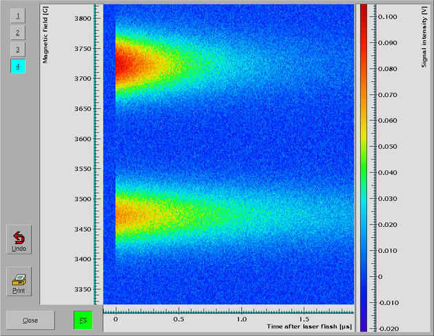
Because it would take too long to do a real 3-dimensional display (and the result often doesn't give you too good a view of the date) the data values are displayed using a color code, where blue stands for the lowest and red for the highest values. To show which color represents a certain value on the right hand side another axis area for the z-axis is drawn. The color bar in this axis area indicates the exact scaling.
In 2D-display mode only one curve can be displayed at once. Thus the buttons in the upper left hand corner for the different curves have a different meaning from the one in 1D-displays. Here they are used for switching between the different curves, i.e. only one of the buttons can be active at any time and will indicate which curve is currently shown. Each of the curves can have its own scaling.
As long as there are no measured data for some of the points of the display these points will be drawn in a dark gray.
In 2D-display mode the same combinations of mouse buttons (or the mouse wheel) can be used to determine the values of data points and differences between points as in 1D-display mode with the only exception that now triples of numbers are shown for the x-, y- and z-value.
When the surface with the data set is moved out of the area of the display arrows will be shown at the sides of the display area where you have to look for the data set.
| • Rescaling and moving in 2D-Display |
|
|
|
|
|
|
|
|
|
2.2.2.1 Rescaling and moving in 2D-Display
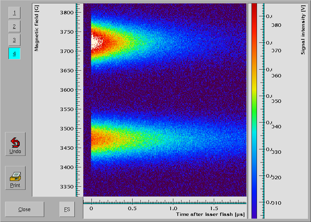
All the methods for rescaling and moving are the same as in 1D-display mode. Additionally, you also can change the z-scaling. This will result in a change of the colors used for displaying the data. When changing the z-scaling it may happen that some of the data points can't be displayed with the available colors anymore. In this case data values larger than the maximum value of the z-axis will be drawn in white, and data that are too small are shown in a dark kind of blue.
Here is an example of how the display may look after a z-rescaling. A lot of the values are now too small to be drawn using the values shown on the z-scale and are thus drawn in dark blue, while the maximum values at the top of the high-field signal are too large and thus drawn in white.
|
|
|
|
|
|
|
|
|
2.2.3 Cross Sections
Quite often one needs to examine cross sections through a 2D-data
set. This can achieved by holding down the <Shift> key and
clicking with the left mouse button into either the x- or y-axis area at
the position you want the cross section of. When you release the left
mouse button a new window pops up showing the cross section (please keep
the <Shift> key pressed down until this new window is
shown). While the left mouse button is pressed down the cursor is
changed to a vertical or horizontal
arrow, i.e. either  or
or  .
.
Even though the new window with the cross section through the data set only shows an 1D-curve it also has a z-axis. On this axis a red indicator shows the value for which the cross section in either x- or y-direction was taken.
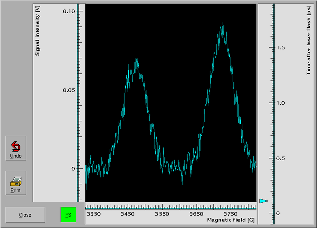
The z-axis area at the right side in the cross section window can also be used
to select a cross section at a different position. When you press the left
mouse button in the z-axis area the cursor changes to an arrow pointing to the
left
,  ,
and if you move the mouse (while keeping the left mouse button still
pressed down) new cross sections are displayed in accordance with the
current mouse position (and the indicator gets redrawn at the position
of the current cross section). If you want to run through all cross
sections sequentially you can also use the up- and down-cursor keys or
the wheel of a wheel mouse. To get to the first cross section (i.e.
the one at the lower end of the z-scale) press the
,
and if you move the mouse (while keeping the left mouse button still
pressed down) new cross sections are displayed in accordance with the
current mouse position (and the indicator gets redrawn at the position
of the current cross section). If you want to run through all cross
sections sequentially you can also use the up- and down-cursor keys or
the wheel of a wheel mouse. To get to the first cross section (i.e.
the one at the lower end of the z-scale) press the <Page down>
key, to get to the last one press the <Page up> key.
Of course, getting data values and differences between data as well as zooming and moving the curve around on the screen works in the same way as for normal 1D-displays.
Finally, occasionally you might want to switch from a cross section
through the data set in x-direction to one in y-direction or vice
versa. To do so start of as you would do when determining data values,
i.e. by pressing both the left and the middle mouse button. Move the
mouse to the new position where you want the cross section in the other
direction. Now hit the Space bar and the cross section in the
other direction is drawn.
|
|
|
|
|
This document was generated by Jens Thoms Toerring on September 6, 2017 using texi2html 1.82.